
The artist Barry E. Jackson shared a concept image of the original version of “Shrek”. The very different look of the successful DreamWorks animation shocked fans.
Barry E. Jackson, an artist who worked on the production of “Shrek”, shared an original image of the first version of the ogre on his Instagram. The darker design came as a surprise to the most dedicated fans of the 2001 animation.
On his studio’s YouTube channel, The Zoom Art Studio, Jackson explained how the film changed since the early stages of development.
“‘Shrek’ started as a dark and bold low-budget film. This animation was ‘more or less’ my design concept,” he said about the first test of the movie from 1995.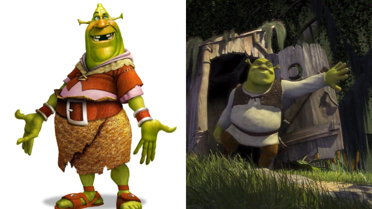
The design received praise from some fans and criticism from others. “This looks like a scary mix of Wallace & Gromit and the Grinch,” noted one fan.
“The amount of changes from the original test to the final product is insane,” remarked another. “I’m still in shock that ‘Shrek’ ever looked like this,” wrote a third. A fourth said it looked like a “horror film.”
The character’s design changed after many discussions about the different visions from the conceptual artists of the film, Ruben Hickman and Barry Jackson.
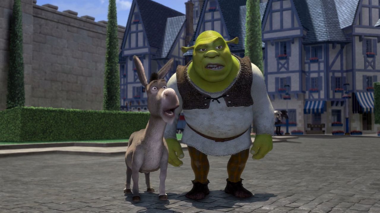
Jeffrey Katzenberg, who was the CEO of DreamWorks at the time, chose the lighter version, which became popular with audiences in 2001.
“The lighter version won in the end because in many ways, it had to. A color palette with dark tones would never have had the same effect on a wide audience as ‘Shrek’ did,” he explained.
See this post on Instagram
Photo: Netflix Instagram @barry.e.jackson. This article was created using AI and reviewed by the editorial team.
